New Website

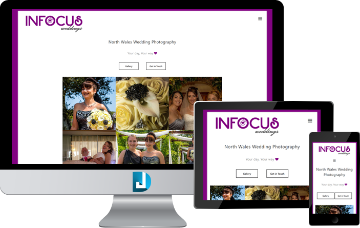
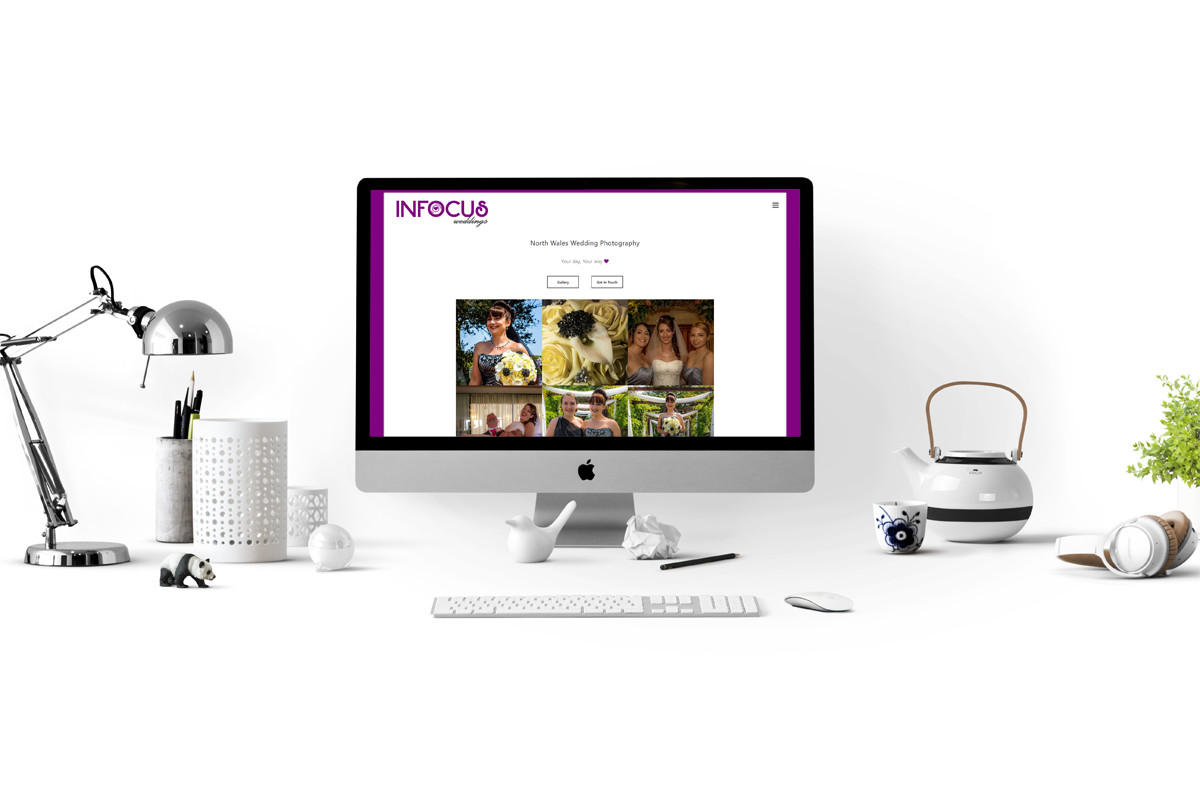
The new InFocus Weddings website features 3 main areas:
Homepage:
Featuring some of their fantastic photographs, along with the important contact us links and an additional link into their gallery of albums.
Gallery:
A fully dynamic, easy to manage and update photo album system, allowing the InFocus team to add to their gallery easily as time moves forward.
Contact Page:
A professional contact form, matching the mobile-friendly responsiveness of the rest of the website, makes contacting InFocus with wedding enquiries really sleek.
InFocus Weddings had a clear vision of how they wanted their website to look. They wanted the traditional 'white portfolio' style of website, which looked just as great on mobiles and tablets as it does on laptops and computers. They were very happy with the outcome.
New Logo

The new InFocus Weddings logo branding has been designed compatible to be placed on any type of media. Windows, car vinyls, even their professional attire during a shoot. Their new branding is relevant, modern and as dynamic as their business needs it to be.


